Produced in 1968 by Finnish architect Matti Suuronen - these are 'quick-placement' houses to be used as ski cabins or 'vacation saucers'.. 100 were made and only 18 known to survive in the u.s. (article in Vanity Fair Jan2012 which I bought to read on the train down to Salisbury). They're 500 sq foot, with circular fireplaces in the middle and a kitchenette and bathroom in one bit. Cannot believe that some people own these - I want one.
2011-12-28
2011-12-02
Tom Darracott
SHOWREEL from Tom Darracott on Vimeo.
Designer found by my co-intern Ben.
"Tom Darracott is an independent designer and art director. After studying an MA in Visual Communication at Saint Martins, Darracott joined the design studio Village Green, where he worked across the spectrum of graphic design, ranging from corporate branding to 3D illustration."
2011-11-30
type and jackets
Rarely do I make posts about fashion, but I want this archival 1970s Pantone quilted bomber jacket loads. Here it is. And it's from this website Fruition Las Vegas.
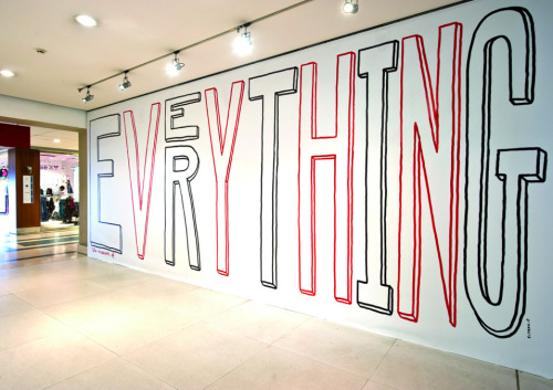
Typeverything is a really goooood site full of nice typography and funny posters.
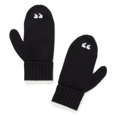
Also I laughed when I saw these.. Perfect cos I really do 'air-quote' all the time. Kate Spade Air Quote Mittens (a "snip" at $65..)
2011-11-24
Visionaire larger than life
In this video some models take the Visionaire larger than life magazine down to a New York park for a little read.
The version seen there is almost 5 x 7 ft, and only 250 were produced.
A standard copy (3x4ft!), at 2,500 copies, is also available.
Their typeface is really nice too.
See http://www.visionaireworld.com/
2011-11-20
clever cute industry stuff
Grand "Collaboration" from HUSH on Vimeo.
Collaboration for an unknown client, between Grand, and Hush, both US agencies. Hush: "Using a smartly anti-tech approach, Grand asked us to focus on the way people collaborate to produce amazing things - a simple concept that goes back to the caveman and his stick. We would develop an iconic character and visual stories that cut through the tech and speak towards people working together, for good and for bad."
2011-11-07
Disassembly
VW Golf. (not sure of the photographer/disassembler)
Pentax Camera - Todd McLellan
Old Flip Clock - Todd McLellan
Smith Corona Typewriter - Todd McLellan
http://www.toddmclellan.com/
2011-11-04
VERY nice design
GrandArmy and Wieden+Kennedy's 'Attack', both from NYC worked on a collection of publications, called 'Day Trip' that chronicles the perspectives and lifestyles of people who influence the shifts in New York City's cultural tides. Really makes me wanna go back. The typefaces - titles and weighty numbers - and the printing are very accomplished.
http://grand-army.com/daytrip1.php
http://attack.wknyc.com/daytrip.php
2011-11-03
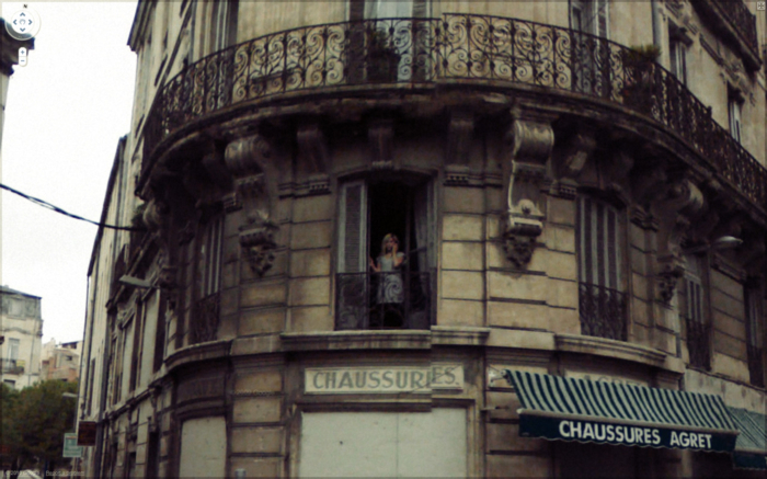
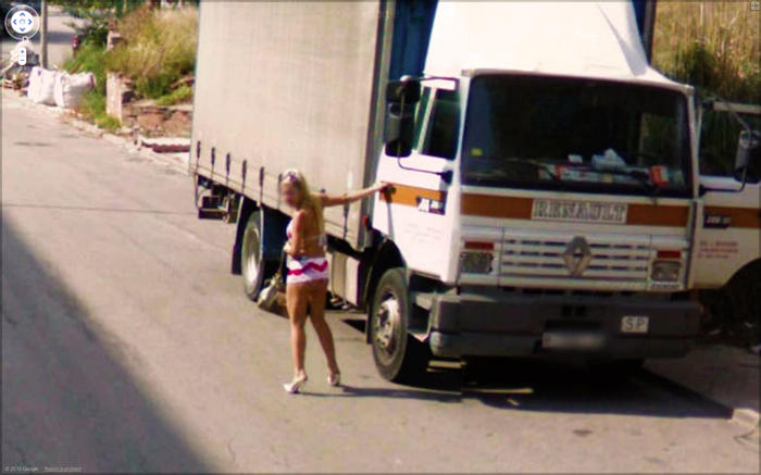
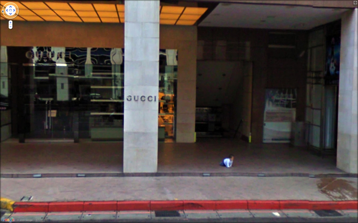
Jon Rafman’s Google Street Views « Thought Catalog
Images all found by trawling through Google Street View.
A 'thought catalog' writer has gone quite deep into this work, saying:
"These photographs, or I should say curation, are less about seeing than imagination, fueled, ironically, by the boring empiricism of life. We understand perfectly the preceding and subsequent moments of each image. A man crashes his car and lol calls his cell phone. A dog pisses legs raised on a wall, cognizant of and shamed by its non-humanness. A man vomits next to a pay phone, barely missing his shoes. The formal compositions of the photographs barely matter, and after a while, the subjects — the unwitting representatives of our race — seem to blur into one. All the drama — the car crashes, the indignant moonings and middle fingers, the near or imminent deaths, the police arrests, the mysterious fires — are slowly taken for granted, soon to reside in a shallow past, a pool in which we put our own shady memories."
2011-11-02
2011-10-31
2011-10-28
2011-10-21
2011-10-17
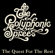
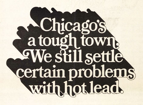
Herb Lubalin
Herb Lubalin : famous art director and graphic designer, famous for designing the 'Avant Garde' typeface.
2011-09-26
Ind-yah
Calcutta / Kolkata, for 4 days, staying in rather luxurious accommodation. Had flight tickets sent to our door and departed for Bagdogra where we took a cab for 3 hours up the mountain to Darjeeling.
This is our hotel, where i write this from. Dekeling Hotel FYI.
funny picture.
After picking up 3 bespoke suits for my travelling partner, we shall be on the road to Delhi, then Manali and Kullu - the north bit on the west side.
This is our hotel, where i write this from. Dekeling Hotel FYI.
funny picture.
After picking up 3 bespoke suits for my travelling partner, we shall be on the road to Delhi, then Manali and Kullu - the north bit on the west side.
2011-09-06
stumbled-upon-music-videos
Tom Vek: Aroused
Director: Saam Farahmand
Producer: James Waters
Choreography: Jennifer White & Leah Mckesy
Editor: Tom Lindsay
Hair & Make Up: Dorita Nissen
Director of photography: Will Bex
Styling: Nova Dando
Tom Vek - "It's a nod to the way in which smoking is used heavily and quite innocently in art and fashion," says the indie music anti-hero. "In the video, it represents feelings of being overwhelmed and extremities—both of which tie in with the sentiment of the album."
Smoking is cool?
Awesome video. Blonde girl with the fringe, Allie Epps, a fellow Chelsea arts clubber.
Temper Trap - Love Lost:
Very representational of English P.E. Lessons.
2011-08-09
2011-08-05
Various things
An attempt at album artwork, using stock photography.
A screenshot from the end of an episode of 'Treme', a US show following characters living in New Orleans, post-Katrina.
Photo taken on the rooftop of our old flat in Streatham Hill.
Portrait, Camberwell.
2011-07-27
Pink Chihuahua
A drawing by my friend, the amazing, CJ BURNETT, of a pink chihuahua, to be used as the identity for a mexican cocktail bar in soho. The trace was what we worked with to make a few designs, below you can see the 'psychedelic version'.. the final image used will most likely be the dog's head with a black background. Many hours of backbreaking work spent in front of Photoshop and Illustrator. Good fun in the end and many free cocktails as a reward.
2011-07-11
A love letter for you
I saw this project among other impressive new design / inventions at the Brit Insurance design awards at The Design Museum.
"Love Letter is a project by Stephen Powers with the City of Philadelphia Mural Arts Program and is sponsored by the Pew Center for Arts & Heritage through the Philadelphia Exhibitions Initiative."
Stephen Powers used to be a prolific tagger and graffiti artist (under the name ESPO) in Philadelphia and New York in the 90s, his work blurring the lines between legal and illegal. In 2000 he gave up to become a proper artist, and later in the decade he began Love letter, for which ESPO and his crew painted more than 50 murals along the elevated train along Market Street in West Philadelphia.
The book and a slideshow of the images was on display in the museum. Here are some of the murals.
2011-05-26
!
Top 3 images: making headings for my development files in letterpress. The 1,2 and 3 are a nice typeface called Flaxman.
Final (4th) image: my two finished, bound, title-banded books, and the box and box cover which all my work will go in.
Subscribe to:
Posts (Atom)